Mission
As part of a transformation programme, and re=branding, I needed to digitise and streamline the user journey for users facing homelessness to find the appropriate help.
Impact
- 21% increase in calls being answered
- 50% reduction in abandoned calls
Role
- UX designer
- Interaction designer
- Stakeholder management
- Design system
- Prototyping
- Usability testing
Why was this project needed?
Necessary outcomes
- Improve the experience for those who are in a vulnerable state looking for housing, to get the helpful information and aid that they need depending on their situation.
- users to self serve
- Reduce number of enquiries about housing criteria.
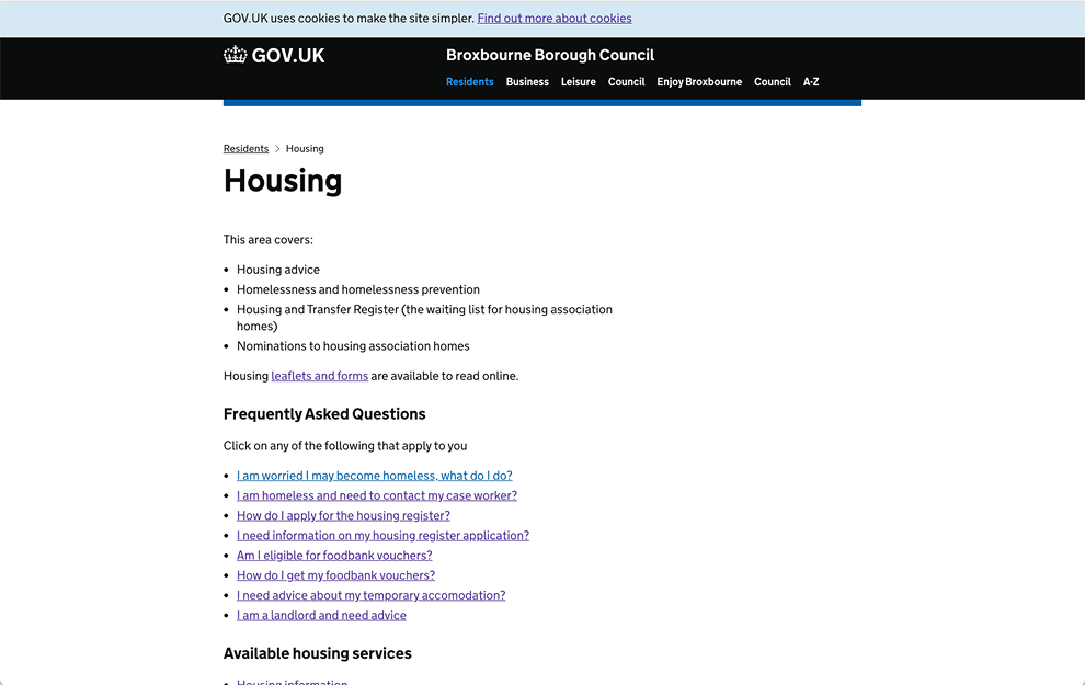
Initially I was provided an existing work-in-progress prototype created by a previous team. However after speaking to the product owners and my analysis showed that the fidelity was not sufficient, so I proposed we adopt the GDS front end toolkit with its accessibility standards already in place to enhance the fidelity. This was easy for the client to agree to and allowed me to perform usability testing.
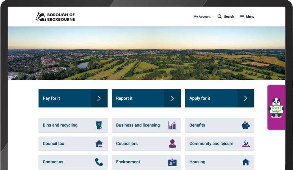
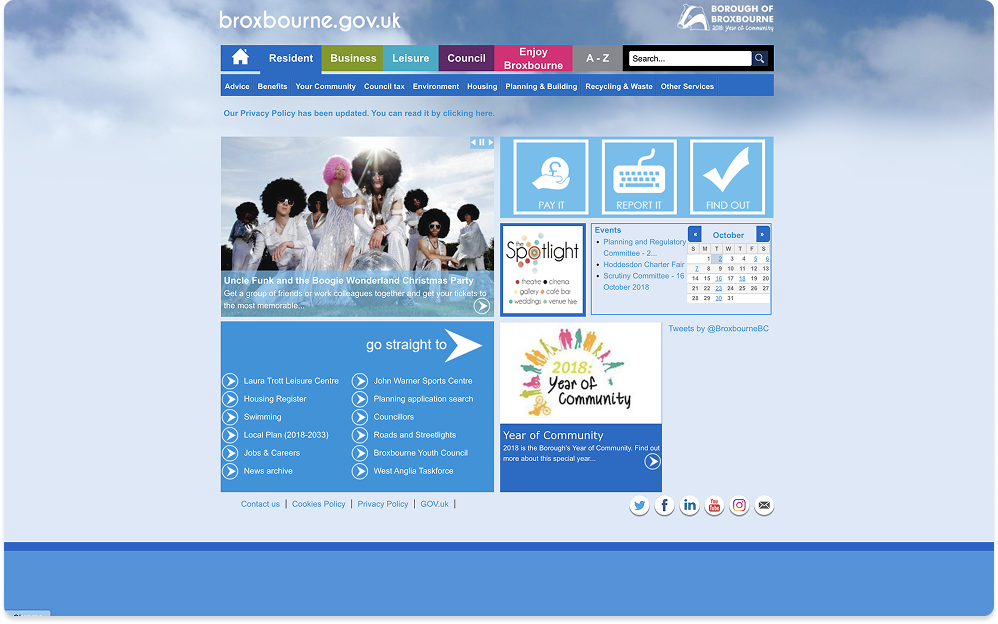
As Broxbourne’s digital capability wasn’t at the right level at the time. the process for users was to get brochures from the council or download multiple PDF’s which were confusing and didn’t really apply to their situation, which in turn frustrated them and therefore needed to contact the council for guidance.
Research
I carried out initial research by recruiting people queuing at the housing department, after they had finished their business at the counter. I proceeded to gather feedback on their experience that day and to understand what information they required to help their situation. From the initial research I surfaced the following key insights that I needed to address in the next prototype.
- 1It was extremely complex navigating the amount of information available.
- 2Users wanted tailored information that was specific to their situation.
Prototyping & usability testing - Round 1
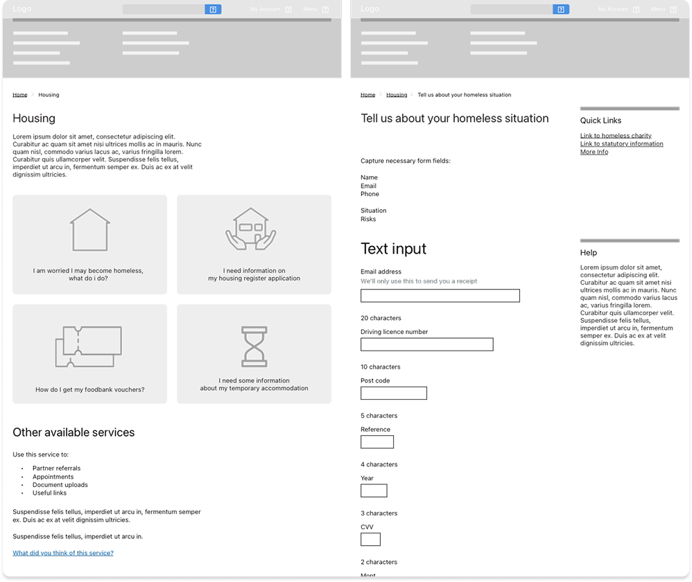
Using the GDS frontend toolkit as my starting point, I added rich content from Broxbourne's printed matter to start gaining insights that would further improve the prototype.
I worked alongside a user researcher to build a script for our usability testing sessions, which brought out some great insights and helped to define the design language that we would apply to the design library.
Below are some of the themes that were identified in the first round of prototyping.
- 1Hierarchy of buttons needed re-ordering to put common scenarios on top.
- 2No personalised information so the content felt too generic to the user.
- 3It was unclear why the user was filling a form.
- 4Familiarity with GDS instilled a sense of confidence and trust.
Prototyping and usability testing - Round 2
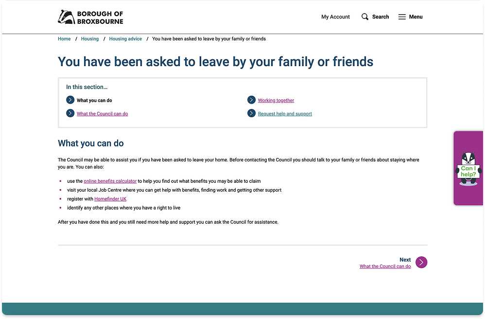
Using the key insights as a basis for the next round of prototyping, I adopted Broxbourne’s new brand identity to customise the look and feel, while maintaining the accessible nature of the components. I added a short questionnaire into the journey, which would only provide information that matched the users situation and reduced the amount of information they had to filter through.
The landing page provided clearer direction why they were filling the form.
Outcomes of the project
- 121% increase in calls being answered.
- 250% reduction in abandoned calls.
- 3Broxbourne have re-invested staff capacity in higher value activities.